01
01
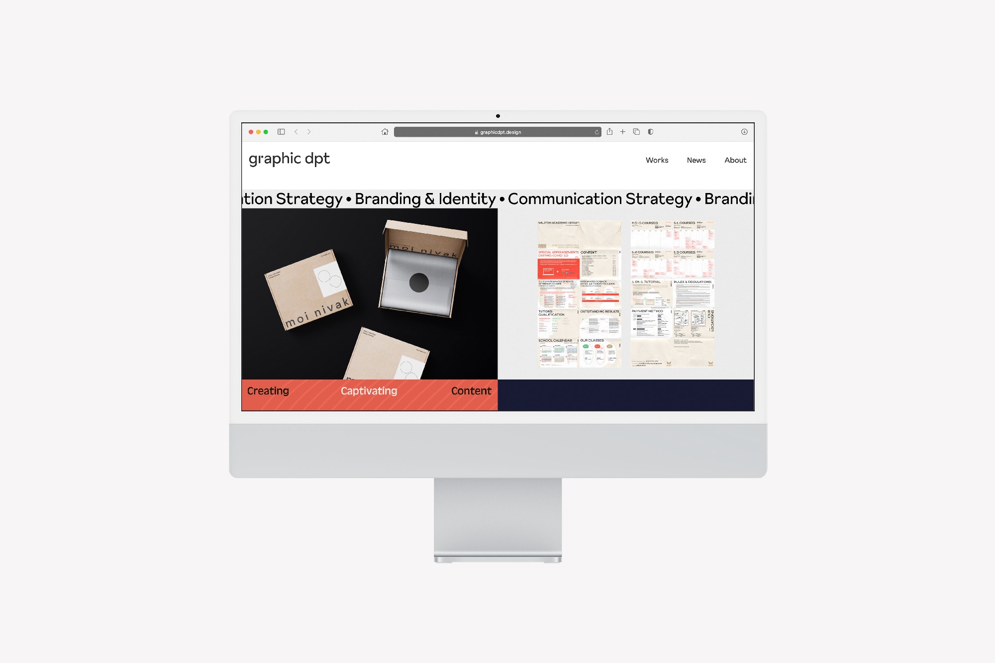
Graphic Dpt
Graphic Dpt

Client
Client
Graphic Dpt
Graphic Dpt
Type
Type
Brand Identity
Brand Identity
,
,
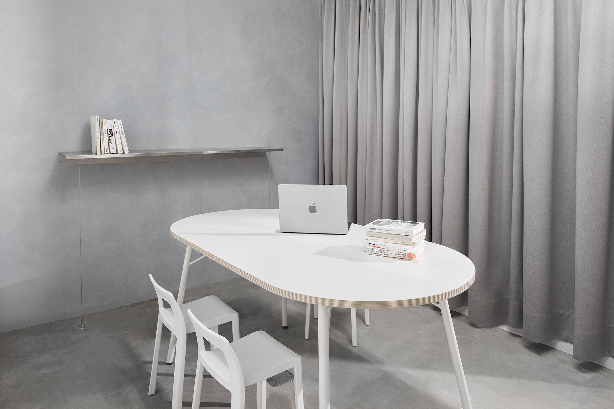
Spatial Design
Spatial Design
Year
Year
2022
2022
About
About
The rebranding project commissioned in 2022, crafted for the design office Graphic Dpt. Originally established in 2018 with locations in Hong Kong and Taiwan, Graphic Dpt specializes in branding and identity design, brand strategy, and communication design.
The rebranding project commissioned in 2022, crafted for the design office Graphic Dpt. Originally established in 2018 with locations in Hong Kong and Taiwan, Graphic Dpt specializes in branding and identity design, brand strategy, and communication design.
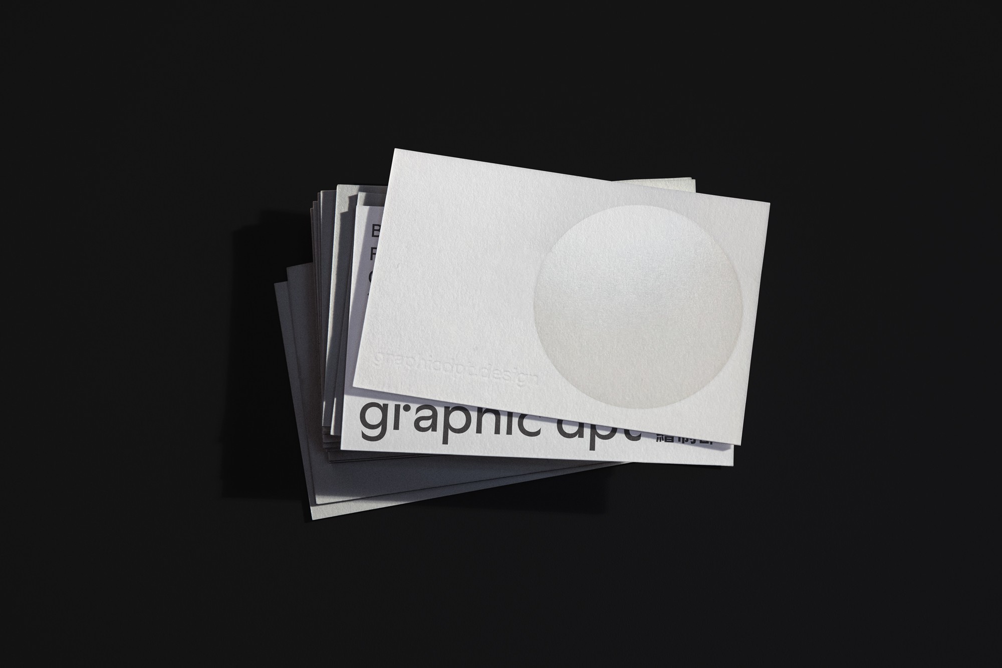
It all started from a circle – the basic elements: dot, line, shape of design. The circle symbolizes the vision of “Ignite from infinite possibilities.” As a visual motif, it reflects both the foundational essence of design and the studio’s belief in process-driven creativity—where curiosity and intention meet. From this core concept, we developed a system that could grow and adapt without losing its coherence.
It all started from a circle – the basic elements: dot, line, shape of design. The circle symbolizes the vision of “Ignite from infinite possibilities.” As a visual motif, it reflects both the foundational essence of design and the studio’s belief in process-driven creativity—where curiosity and intention meet. From this core concept, we developed a system that could grow and adapt without losing its coherence.


The rebranding was not only about refreshing the visual identity but also about articulating a clearer voice for the studio as it entered its next chapter. Graphic Dpt evolved from a small, independent practice into a cross-regional design consultancy with multidisciplinary collaborations and clients ranging from cultural institutions to tech startups. The new identity needed to reflect that shift: a studio rooted in clarity and thoughtfulness, yet dynamic and experimental in its approach.We started with a refined logotype—minimal, typographically balanced, and custom-built with soft geometric forms to subtly echo the circle origin story. A modular identity system was created to allow flexibility across print, digital, and spatial applications. The brand palette shifted to a monochromatic base punctuated with vibrant accents—visual sparks that hint at the energy of creation. Typography was reimagined using a clean grotesk paired with a humanist serif, allowing the brand to speak with both rationality and warmth.
The rebranding was not only about refreshing the visual identity but also about articulating a clearer voice for the studio as it entered its next chapter. Graphic Dpt evolved from a small, independent practice into a cross-regional design consultancy with multidisciplinary collaborations and clients ranging from cultural institutions to tech startups. The new identity needed to reflect that shift: a studio rooted in clarity and thoughtfulness, yet dynamic and experimental in its approach. We started with a refined logotype—minimal, typographically balanced, and custom-built with soft geometric forms to subtly echo the circle origin story. A modular identity system was created to allow flexibility across print, digital, and spatial applications. The brand palette shifted to a monochromatic base punctuated with vibrant accents—visual sparks that hint at the energy of creation. Typography was reimagined using a clean grotesk paired with a humanist serif, allowing the brand to speak with both rationality and warmth.


Credits
Creative Direction
Billy Cheung
Spatial Design
Billy Cheung
Credits
Billy Cheung
Creative Direction
Billy Cheung
Spatial Design
Quote